Why Do You Need a Mobile-Friendly Website?

As smartphones become ever more affordable and certainly more widespread, studies show consumers prefer to use them to access the internet instead of using more bulkier desktop or laptop devices. In fact, desktop web traffic has been decreasing for over ten years, while mobile web traffic has continued to grow exponentially!
Yes, in recent years, online activity has increased tremendously mobile devices. Since 2015, Google has been emphasising the importance of mobile-friendly websites and persuading website owners to add these features to their sites in order to maintain their search engine rankings. Many local service-based industries are dependent on mobile accessibility.
Many local service-based industries like Locksmith services and Emergency Roadside Recovery are both businesses that clearly need mobile-friendly websites. According to Google, 40% of users visit a competitor's site if they can't access a site from their mobile device, and 61% are unlikely to return to a site that was not mobile-friendly.
If your website isn't responsive (mobile-friendly) most website visitors may find your site is too hard to use and decide to take their trade elsewhere - often to a business that has a more user-friendly site - which automatically gives them a real competitive advantage. Your competitors will never let on!
But keep in mind that while ensuring that your site works well for your users is vitally important, there's more to consider than user preference and browsing habits when you're thinking about your website design. Search engines also look for mobile-friendliness when ranking websites, so for this reason it's also well worth considering how you site works on mobile platforms.
Search Engines and Mobile-Friendliness
Google currently considers mobile usability to be the third most important factor in how a website is ranked. In 2016, Google stated that their bots / spiders would be indexing / crawling mobile versions of websites before the desktop counterparts. This means that any website that is not mobile-friendly will not be ranked as well in Google.
Did you know? Google analytics provides you with a breakdown of which devices your visitors are using when they visit your site.
Create Mobile-Friendly Content
While design and technical functioning are the main considerations so far, let's talk about your content now. When you're creating content for your mobile site, remember that screen space is limited. You need to keep your text concise and to the point, making sure your key information is up front and accessible. Calls to action should be made more prominent, buttons should be bigger and easy to read, and navigation options should be crystal-clear.
Keeping your content mobile-friendly will also improve the user experience when they visit on a desktop browser too. Remember less is ofter more - no one wants to read a wall of text and be forced to search for the information they're looking for.
Improve Your Bottom Line
Mobile-friendliness has proven to be good for business. A recent case study of a retail business showed a 77.59% increase in search engine rankings by converting the company's website to use responsive design. Their conversion rate from mobile devices increased by 15.19%. Elements like a large search bar and a "sticky" header that stays at the top of the screen while scrolling helped make the site more usable on mobile devices. This resulted in people staying on the site longer, which in turn led to more sales.
Implementation
Now that we've discussed the importance of mobile-friendly design, let's look at the different ways it can be implemented.
In general, your site can be considered mobile-friendly as long as it adjusts itself to accommodate smaller screens on mobile devices, like phones and tablets. There's a lot of different terminology that refers to different approaches with the same goal: creating a good user experience for mobile device users.
Let's take a look at what these different terms mean...
Mobile Friendly
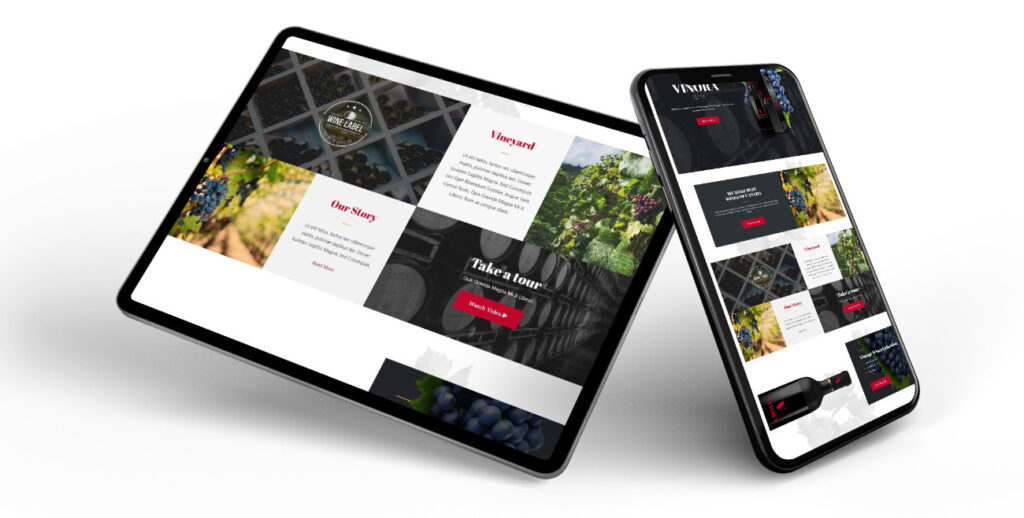
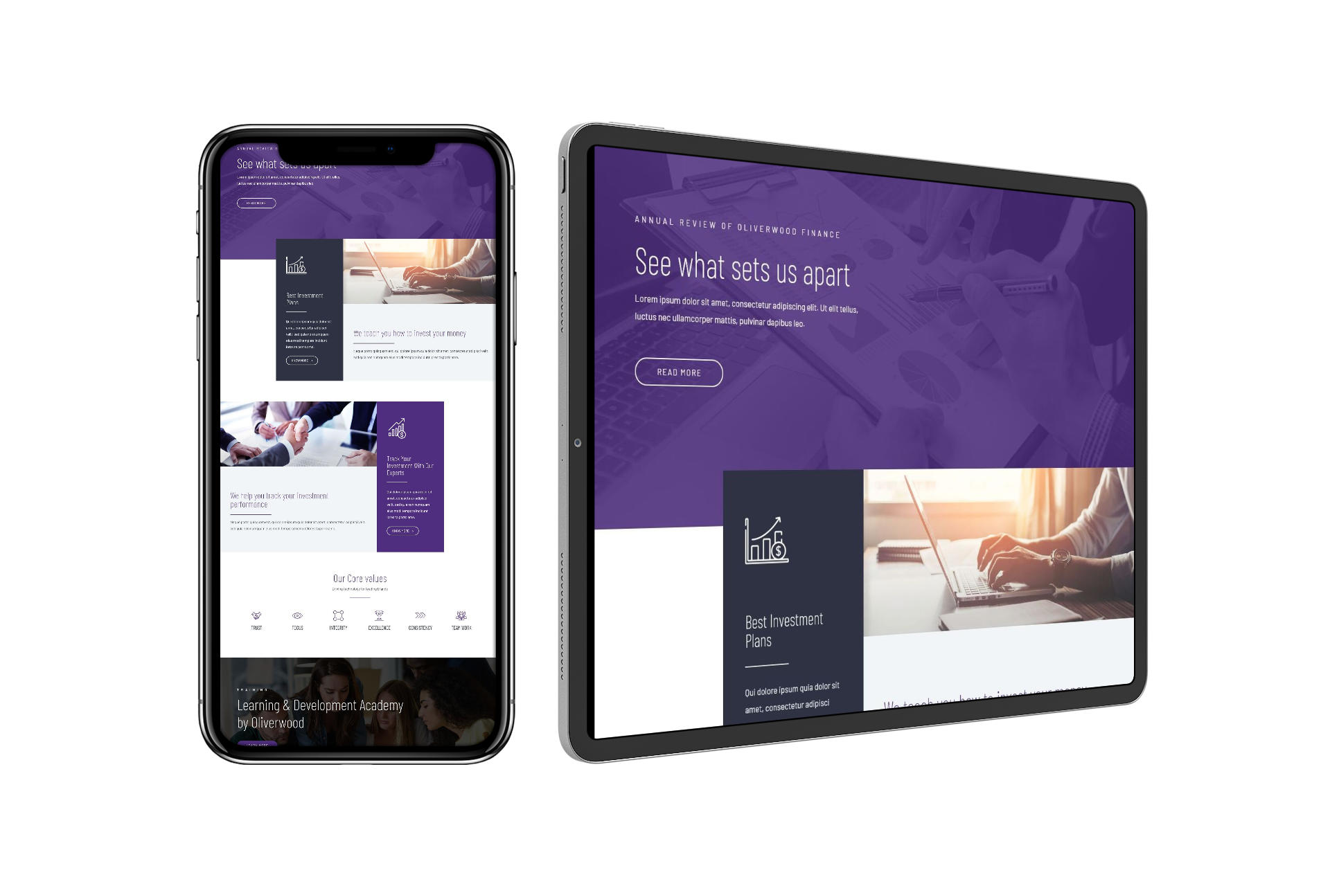
A mobile friendly (or responsive) website loads the same pages on a mobile device as it does on a computer, not shrunk down to fit the screen but built using blocks which stack correctly - one block underneath the next.
Responsive design uses elements with relative sizes that resize to fit the screen they're on, rather than elements with fixed sizes. This reduces scrolling and zooming on smaller screens. Sites that use responsive design should function well and look good on any size screen. If a website is using a responsive design, you can see it in action by resizing the browser window on your computer. Instead of a horizontal scrollbar, columns will shift, images will resize, and navigation will adjust to fit.
Mobile First
Mobile first web design focuses on creating a website that works well on the smallest, least powerful devices, such as basic entry-level smartphones with internet access. As phones become a more and more common way for people to access the internet, mobile first design is a useful approach because it ensures that those users will have a great browsing experience.
It's possible to add new design elements along the way, specifically for display on mobile only screens, taking advantage of better mobile processing power, screen size and resolution improvements. Mobile first approach ensures that the most basic functions will be available for any mobile user, even if they don't have a state-of-the-art new phone.
In order to achieve this, the website is first constructed with the HTML, CSS, and Javascript required for the smallest screens, and then adds exceptions that overwrite that basic code with other options that will only load on a desktop or laptop computer browser. This lets people using their laptop or desktop access more complex functions or large graphics, while keeping the experience streamlined for mobile users.
Adaptive Design
Adaptive design is similar to responsive design, but instead of simply resizing and adjusting its elements, it has different layouts that are specifically designed for different devices. While a responsive website delivers the same pages no matter the device, and they resize to fit, an adaptive website serves the version of each page that is designed for the device it detects.
An adaptive site is likely to use predefined layout sizes, rather than flexible elements designed to be resized. For more information and a demonstration, here's a good look at the difference between adaptive and responsive design.
Separate Mobile Site (or m dot site)
Sometimes it's not feasible to convert an existing website to use responsive or adaptive design. But there's still a good option for a mobile-friendly site. You can redirect mobile users to a subdomain with a separate version of the website. One benefit of a separate mobile site is that it can look different than the main site, highlighting the features that mobile users are more likely to need.
Mobile App
Finally, many businesses have a mobile app in addition to their mobile-friendly website. Customers can install an app on their device that often provides a better user experience than the mobile website. Large retailers like Amazon have an app as well as a functional mobile site, so that they can meet particular device-specific needs.
A mobile app requires a higher degree of buy-in from customers, who have to download and install it on their device using a third party supplier like Apple's App Store or Android's Play. Consumers often prefer apps over mobile websites in most cases, but it's very dependent on the business, and is usually only the case for large brands like Amazon, the BBC, eBay etc that are visited frequently.
Conclusion
If you've created or redesigned your website in the past couple of years, chances are your developer used responsive design. If your site hasn't had a redesign in a while, it's well worth it to have its mobile-friendliness evaluated.
Whether your business is highly dependent on mobile traffic or not, a mobile-friendly website will improve your search engine rankings and create a more user-friendly experience for your customers. Whether you opt for a responsive design or a separate mobile site, it's worth exploring your options to make sure that you're not missing out on potential traffic and sales opportunities.